Final Project Proposal
PSC290 - Data Visualization, WQ2025
Final Project Proposals
- Due at 11:59 PM PST on February 12, 2025 on Canvas
- 1-2 page (single spaced) proposal
- Short background (why do you / we care?)
- Research question(s; only the question[s] you are focusing on)
- Short method (what are the data? Which are you using?)
- Visualization plan (short summary of your proposed visualization)
- Challenges and barriers (what do you struggle with this visualization; are there specific barriers?)
Visualization Plan
Can be any combination of the following:
Text description
- clearly describe axes/scales, fills/colors, panels, etc.
- describe affordances you will build into the visualization to aid understanding
- describe why you chose this visualization
Draft visualization (digital)
- rough visualization of some or all of data
Draft visualization (drawn)
- some roughly drawn visualization showing what you are hoping to do
- particularly helpful if you foresee barriers or don’t know how to do it
- can also draw these on a plot of yours from the past, etc.
Goal
The goal of this proposal is to:
- Provide you with support to build visualizations you may be nervous about
- Anticipate barriers and provide you tools
- Set you up to create a visualization that you are proud of
Scope
What is okay?
- Introducing a new kind of visualization to your area of research
- Offering improvements to “standard practice” visualizations in your area
- Setting up a procedure for a kind of visualization you’ve long wanted / needed to figure out
- Really anything that is both useful to you and displays some sort of mastery of course content
Recommendation
You will have an easier time with this project if you anchor your visualization on a specific research question.
As one brief example, in one of my recent papers, I was interested in the extent to which psychological, situational, and timing factors predicted different momentary experiences and behaviors using person-specific machine learning question (Beck & Jackson, 2022). There were five research questions I was answering more generally, but one was just “Do psychological, situational, time, or full feature sets perform best?” I answered this with the following visualization, which shows the relative proportion of individuals’ psychological, situational, and timing features in their best performing model using a “sequence plot” I stole from genetics (which you’ll notice looks a lot like a rotated stacked bar chart, which it is!).
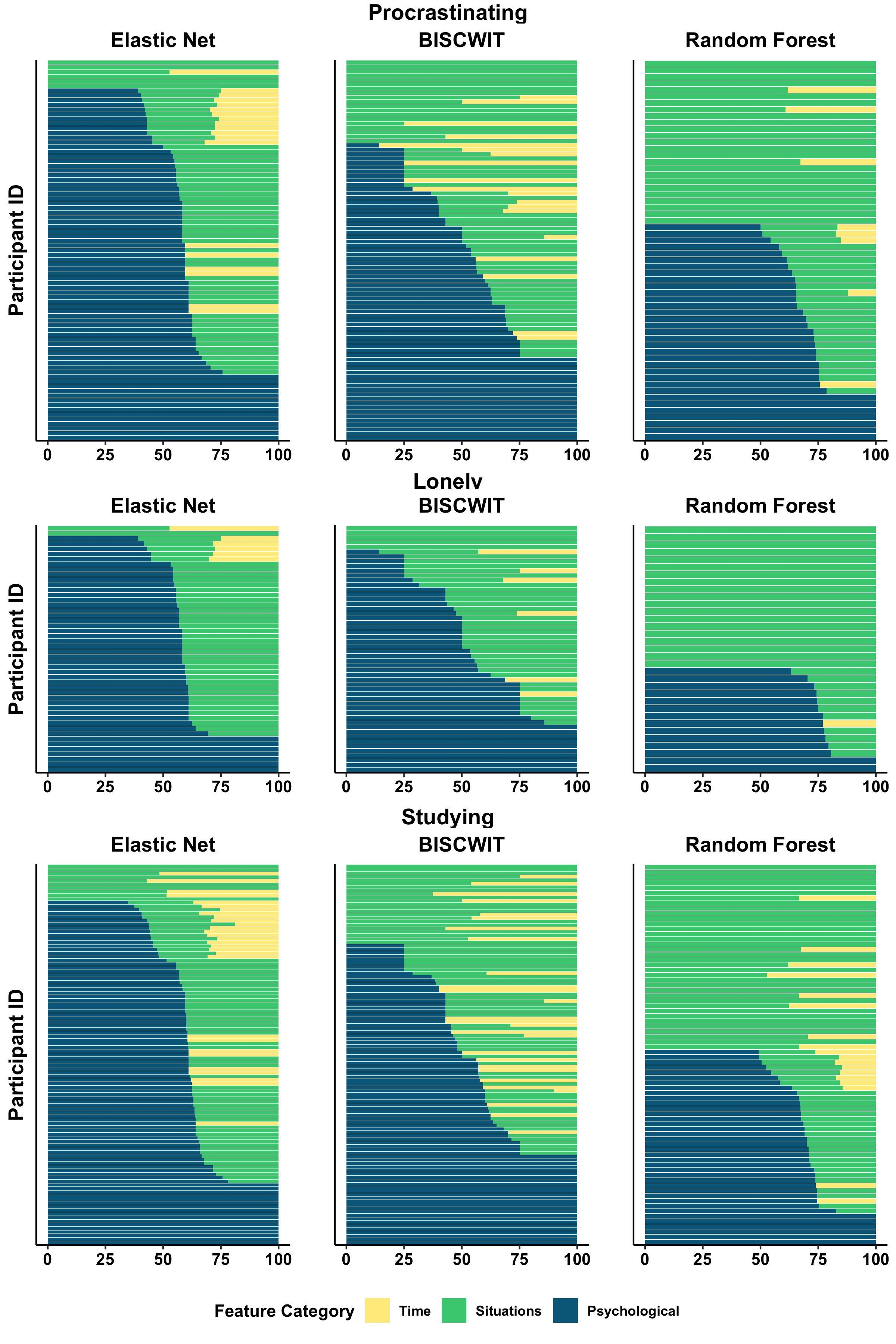
Using a research question will help you to anchor your visualization and allow you to consider the extent to which you think your visualization clearly answers it. While not required, I highly suggest using one.